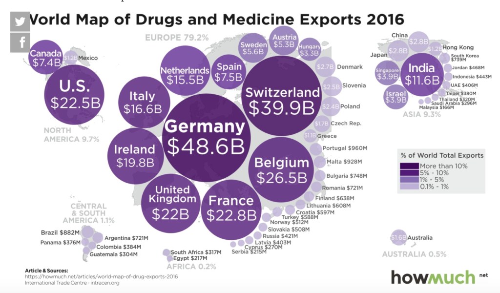
The challenge for this week’s MakeoverMonday was to improve upon an original data visualisation published by Trademap looking at a World map of drugs and medicine exports in 2016.
The original visualisation shows packed bubbles sized by value of exports, coloured by percentage of World total exports.
What did I like?
- The continents are re-sized by value of exports, so the European countries with the largest share of the export market like Germany for example really stand out.
- The use of colour and size works well to show me which countries have a higher value and percentage of the Global export market.
- Every country shown is labelled clearly.
What could be improved?
- The title tells me what the topic is about, although a sub-title making it clearer that it is showing value of exports in $USD would be useful.
- There could be a more impactful title to say something like ‘Europe dominates exports of drugs and medicines’ for example.
- Packed bubbles are difficult to interpret in terms of how much larger the export value of one country is over another. This is mitigated by the labelling of each country, but this at the cost of additional visual information, which can feel cluttered.
- The range of colours could be separated more to distinguish the higher percentages of World total exports.
My makeover approach:
I have learnt a lot over the last 12 months from the Story Telling with Data approach created by Cole Knaflic. The steps of this process include:
- Understand the context i.e. who is my audience, what to show them, how best to do it?
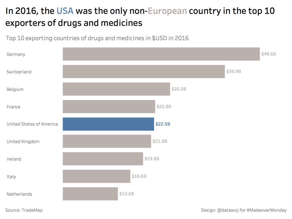
- Choose an appropriate visual display e.g. bar chart instead of packed bubbles.
- Eliminate clutter e.g. reduce the amount of countries shown to the top 10 to reduce the amount of labels required.
- Focus attention where you want it e.g. colour a country to stand out differently from the others and match this in the title.
- Think like a designer e.g. offer affordances on how the user should interact with the chart through highlighting important elements, eliminating distractions, creating a visual hierarchy etc.
- Tell a story e.g. the USA is the only non-European country in the top 10 exporters for drugs and medicine.
Key lessons learnt:
I was really pleased that Eva Murray mentioned my visualisation as one of this week’s favourites in her weekly recap blog. To achieve this has required many weeks and months of learning from mistakes on makeovers throughout 2017. So my lesson is that keep practising if you want to get better at data visualisation!
Following the publication of this blog post, I also had some useful feedback from Cole Knaflic on how “pulling data labels into the end of bars…reduces clutter without removing any actual data”. I agree and aim to practice this technique on the next makeover I attempt. So another lesson is that there is always more you can learn.
Recent Comments