The challenge for this week’s MakeoverMonday was to improve upon an original data visualisation published by TitleMax.com looking at how much profit the 25 wealthiest US companies made per second in 2016.
The original data visualisation:
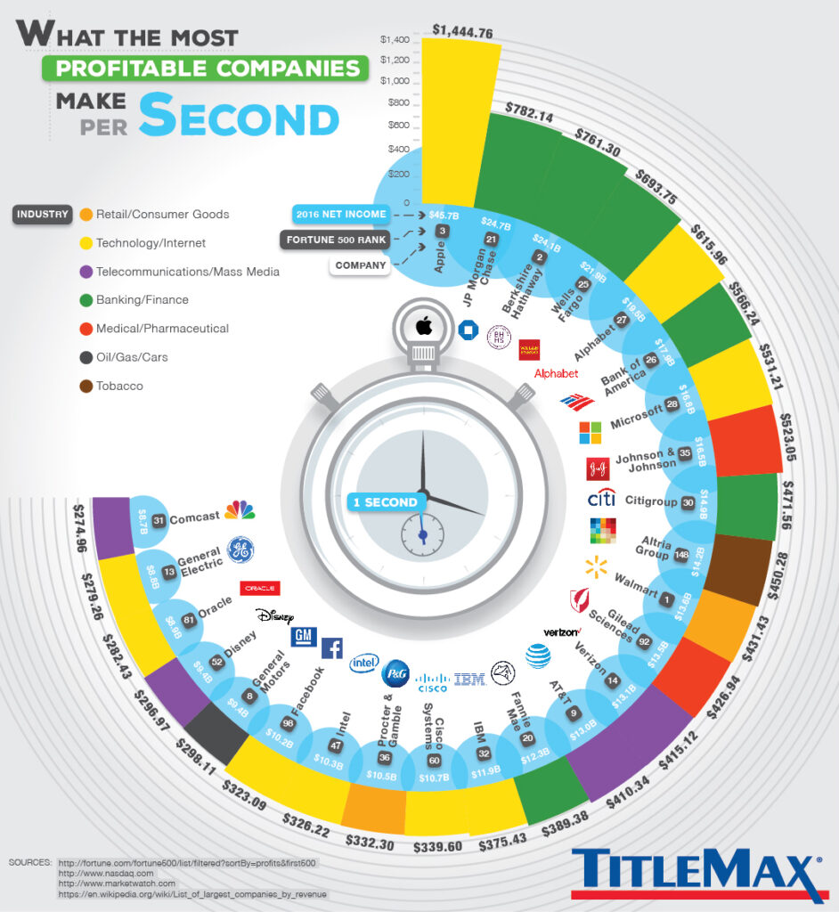
What works well?
- I liked the bright colours, which engaged me instantly.
- Linking the data to the idea of time on a stop watch is interesting.
- Sorting the companies in descending order means that those like Apple with the biggest profits really stand out.
- The labelling on the outside of the bars quickly tells me the values of profit per second.
What could be improved?
- The use of so many images such as the company logos for example makes the design look cluttered.
- The additional labelling about net income and Fortune 500 rank is useful, but means there is a lot of information being shown at once, again adding to the cognitive load of the reader.
- There could be some features removed such as the gridlines and blue circles for a cleaner visual design.
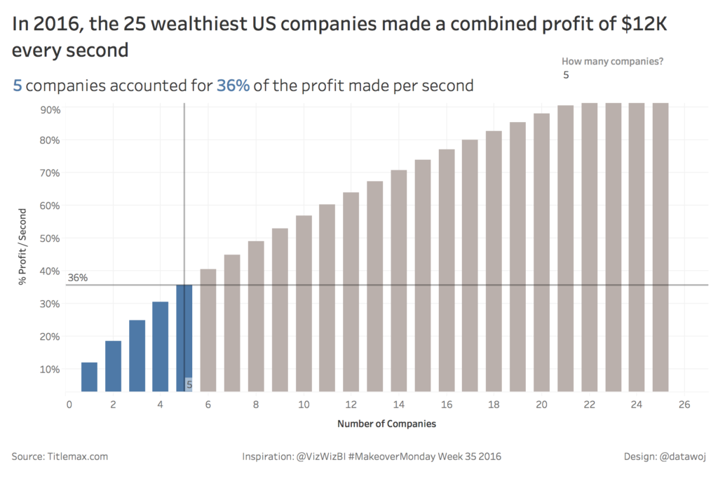
My Makeover Approach:
I wanted to focus upon what proportion of the total profit per second the 25 wealthiest US companies made was due to a small number of companies such as Apple? To do this I used a Pareto Chart, which compares the cumulative percentage of profit made per second to the equivalent cumulative number of companies.
There is a handy Tableau Tip Tuesday tutorial of how to build this chart by Andy Kriebel based upon a similar makeover he published in 2016.
Recent Comments