Introduction:
Each week I take part in a data visualisation challenge called ‘Makeovermonday’. The idea is to take a data visualisation that has already been published and make it over using good practice techniques. I use an industry leading data visualisation tool called ‘Tableau’. Week 25 presented another Big Data challenge using 202 million records measuring air quality in the USA over time, powered by Exasol’s super fast database. The dataset related to levels of ozone measured hourly and daily across US counties and states over several years and the impact upon public health.
In this blog I will tell you my approach to my makeover. Then I will explore the chart type I used called a ‘Box and Whisker‘ chart, making a case for and against it based upon good practice theory compared to practical experience.
The original visualisation:
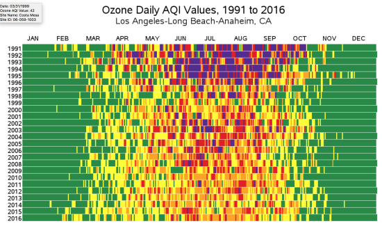
What did I like?
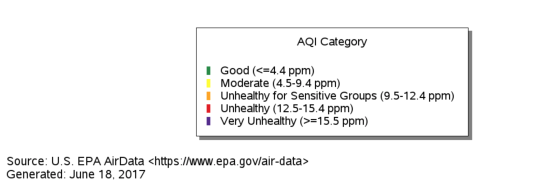
- The colour legend shows which days are healthy or unhealthy throughout each year
- Clear title and source telling me what the visualisation is showing
- Interactivity allows me to drill down through geography and time
What could be improved?
- There is a lack of context about what ozone is and the health concerns
- It could be clearer in terms of showing magnitude of changes over time
- There could be a story board approach to engage the user and help them navigate the trends
My approach:
- To show some more contextual information about a) Ozone levels and b) how they are measured through the Air Quality Index
- To show the size of trends over time more effectively
- Use colour to highlight healthy versus un-healthy days as in the original
- Visualise individual data points daily but drill down to the hourly level
- Tell an interesting story!
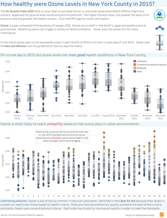
- I picked New York County in 2015 in order to filter down the data. I chose to look within a year rather than across years.
Visualising via a Box and Whisker Chart:
- I tried a new chart type I had never tried called a ‘Box and Whisker’ chart
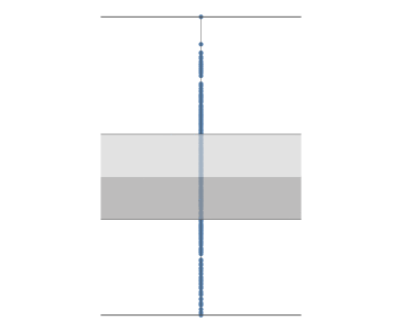
The chart is a simplified representation of a distribution of data.
- The box represents the range between the 1st and 3rd quartiles of data (Interquartile range).
- The middle line represents the median (mid point) value.
- The whiskers represent the outliers of the data points (at 1.5 the Interquartile range).
- Half the data points are located within the box, the other half between the box and the upper and lower whiskers.
For a great introduction to this chart type, I referred to Alberto Cairo’s excellent book on data visualisation for communication; ‘The Truthful Art‘ (2016, p192).
I included two box and whisker charts; one looking at each day in each month of 2015 and another breaking it down further to each hour in each day of July 2015; the month with the highest ozone levels.
There is a great discussion around when to use and when not to use Box and Whisker charts in ‘The Big Book of Dashboards (BBOD)‘ (2017, p61) by Andy Cotgreave, Steve Wexler and Jeffery Shaffer. I will now compare the case for and against presented in the ‘BBOD’ against my own practical experience.
The case for Box and Whisker charts:
- The box and whisker chart shows all the data points; whether there are 20, 2000 or 2 million. It structures the data into boundaries of equal size. As such it is a good chart for showing the distribution of the data.
- It is also good for comparing distributions across categories such as dates in this case. The box and whiskers can be easily compared against one another to see how the medians and the ranges compare.
- It is also effective for identifying outliers above or below the average.
In the practical exercise, the dot plots clearly show the increase in ground level ozone in New York County in the Summer months of 2015. The whiskers are effective for showing that May and June have a greater variance in ozone levels. The middle lines show that it is July, which has the highest median value.
In my visualisation the daily averages showed that for New York County in 2015 there were no days where average ozone levels were not ‘good’ in terms of impact upon health. The second box plot looked at hourly distributions across individual days in July 2015 and highlights outliers which were hitting ‘un-healthy’ levels of ozone. This insight was not apparent when just looking at daily averages.
The case against Box and Whisker charts:
Andy’s co-author Steve Wexler points out that they are less good for identifying individual data points as they overlap. So if that is the goal then this may not be the right chart type. In the book there are examples of charts where data points have been ‘jittered’ so every point is visible.
However in this case it was not necessary to see every data point, rather to identify general patterns of when the ozone levels had become unhealthy. This was achieved by colour coding the data points.
The chart is not the easiest to interpret for an un-trained eye. An aggregated view like a bar chart would be easier for a lay person to interpret. For example this is a comparison of the daily ozone levels for July 2015 in New York County using a bar chart compared to a box and whisker chart:
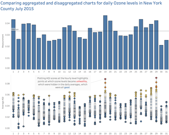
I agree that if we compare the aggregated bar chart against the disaggregated box and whisker plot, the former is easier to understand at a glance. The boxes and whiskers, whilst adding more insight also add more clutter to the visualisation.
Although as Andy Cotgreave states in the BBOD (2017, p61) that “as with all charts, people can be trained to use them”. Box and whisker charts may seem intimidating at first, but once you know what to look for I think they become easier to use. However, adding more contextual information to help train users does present some design challenges in terms of not over complicating the view. As such I included a logo with a tooltip on how to use the chart.
It is important to identify the audience in mind, and their ability to interpret a more complex chart type (Cotgreave et al, 2017, p55). I designed the visualisation with a generalist audience but with a keen interest to take the time to read the visualisation e.g. an environmental campaigner.
It is very subjective in terms of how visually appealing Box and Whisker charts are and I know some people don’t like them. Well beauty is in the eye of the beholder as they say. As Andy also says ‘it depends’ on the context or the audience. I think they are visually appealing for an informed audience interested in digging a bit deeper into the data distribution.
Conclusions:
A complex subject based upon a large dataset can be visualised using either simple aggregate level bar charts or more complex disaggregated charts such as the Box and Whisker Chart. Which approach to take depends upon who the audience is and the aim of the visualisation.
Box and Whisker charts are suitable for comparing distributions, showing outliers and drilling down into more detail. In the practical exercise the chart allowed us to view seasonal patterns of ozone levels, compare ranges and identify the months with the highest medians.
This chart is less suitable if we want to compare individual data points as they overlap. However this is less important as the boxes summarise the data distribution and allow general comparisons to be made.
The chart is less accessible than the bar chart view when looking at hourly emissions by day. However the aggregated view misses the detail of insights which the colour coded dots give us. The key learning point is that we often rely upon averages which hide underlying patterns.
Additionally with training supported by guidance notes the user can soon learn how best to use this chart type. Hopefully, in future it then becomes easier to use. However, this can present design challenges in terms of additional contextual information.
In terms of whether the Box and Whisker chart is attractive or not then I will leave that up to you to decide. I personally think they have their own aesthetic qualities.
Recent Comments