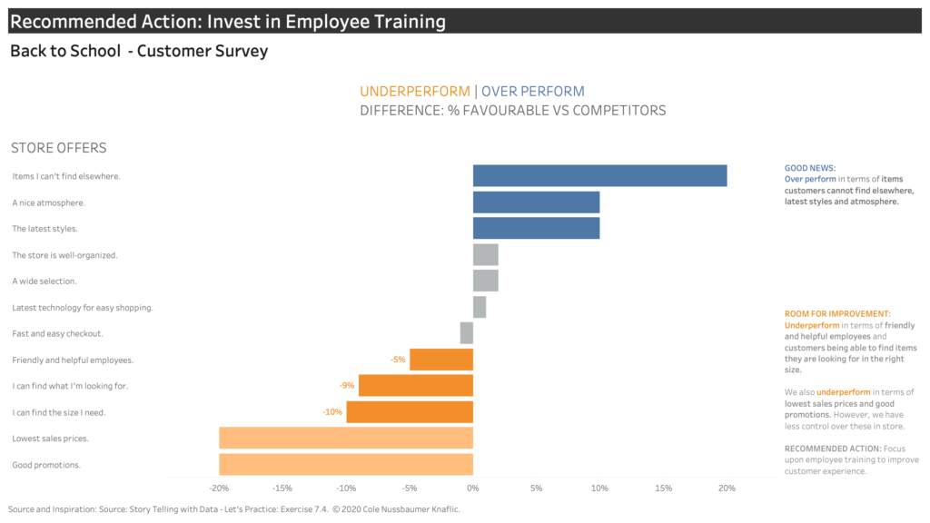
How can we visualise useful insights from customer survey data?
Iterating through different designs can help come to the right chart solution to answer the right business question.
This avoids visualising data that doesn’t answer what your stakeholders really need to know.
In this visualisation the insights from a customer survey inform actions for a store to improve the customer experience.
The designs are based upon the recreating solutions from Storytelling With Data – Let’s Practice Exercise 7.4 © Cole Nussbaumer Knaflic.
I learned a lot from this process including:
- Transitioning from a bar chart to a diverging bar chart more effectively shows the differences. Showing the gap between our store and our competitors
- Ensuring the colour focus aligns clearly with a relevant call to action. To address employee training in order to improve customer satisfaction.
- The little aspects of dataviz can make a big impact on visual design. For example, ensuring the colour legend for the diverging bar chart aligns with the over or under performance.
Click on the visualisation to follow the design journey through.
Recent Comments