Visualising the natural World around us – basic bar charts versus square area charts
I recently participated in both the March and April 2018 Story Telling with Data Challenges: Basic Bar Charts and Square Area Charts respectively published by Cole Knaflic. This got me thinking about the pros and cons of both a common, simple chart type such as the basic bar chart versus a more unusual and complex chart type such as the square area chart.
I have been recently inspired by reading the ‘Dear Data‘ book by Giorgia Lupi and Stefanie Posavec, which is a catalogue of their year of collecting data based upon the World around them, visualised through sketches and then shared with each other via the medium of postcards.
Both my entries to the SWD challenges were based upon collaborative data projects with my wife Ann, who writes a blog called ‘Green City Gardens‘. The focus of her blog is the role that gardening has to play in an urban setting in terms of improving our environment, for both people and wildlife.
“Ever since we were young, we have been fascinated with collecting and organising information from the World around us.” (Lupi and Posavec, 2016)
The Basic Bar Chart
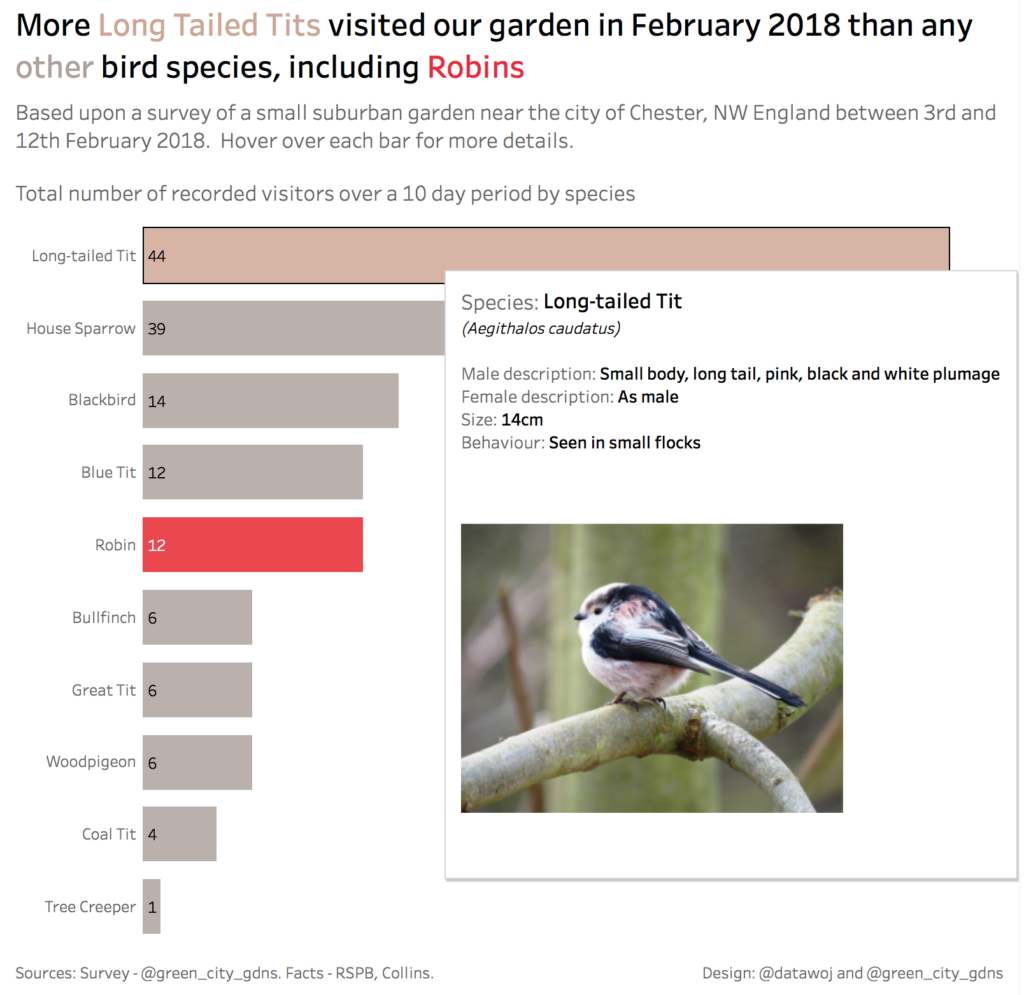
My entry for the Basic Bar Chart Challenge was based upon a survey of birds visiting our sub-urban garden in Chester, NW England. For more information on the methodology and insights then please read this blog on the Green City Gardens website.
My design goals were to:
- Develop my own basic bar chart style
- Use colour sparingly to focus attention on two bird species
- Reflect this in an insightful title
- Practice labels nested within the bars
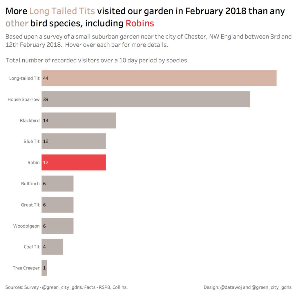
I also wanted to pilot using Tableau’s new ‘Viz in Tooltip‘ functionality – as users hover over each bar they see more details about the bird species. This is a great addition, which enables more detail to be packed into the visualisation, whilst keeping the basic bar chart nice and clean.
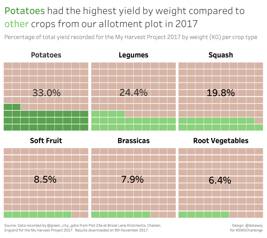
The Square Area Chart
My entry for the Square Area Chart Challenge was based upon data collated from our allotment plot throughout 2017. The data included various metrics on crop types including area sown, weight of yield, value etc. The data was submitted to the My Harvest Project, which aims to collect data on the contribution which people who grow their own fruit and vegetables make to UK food production. For more information on factors affecting harvesting and which individual crops were more or less successful please read this blog on the Green City Gardens website.
My design goals were to:
- Compare crop types by percent of total weight harvested at our plot in 2017
- Use colours which would reflect the allotment plot i.e. green coloured squares would reflect crops growing and brown coloured squares would reflect the soil
What if I had used a basic bar chart?
Drawing upon my experience of participating in both challenges I wondered what would the My Harvest data look like if I had applied my basic bar chart style instead of using a square area chart? It would look like this:
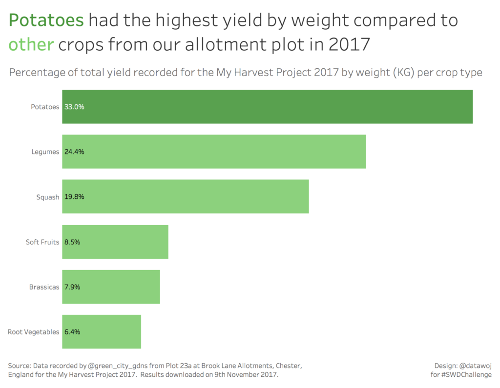
Compare and contrast:
Essentially we are comparing two different ‘pre-attentive attributes’ i.e. length of bar charts compared to the hue and intensity of colour displayed in each square area chart in order to focus our audience’s attention as well as create a visual hierarchy (Knaflic 2015, p99).
Bar charts are familiar territory, which are easy to read for most users. The length of the bar clearly shows that potatoes accounted for the highest percentage of crop yield by weight from our allotment plot in 2017. We can leverage colour to make potatoes stand out from the other crops, although the length of the bar would be sufficient to do this alone. Additionally it is a simple visualisation as we can tell the story in only one chart.
Because of their simplicity and effectiveness, bar charts are ubiquitous as a data visualisation tool. However, they are limited from a design point of view to a strictly analytical view of the data. Apart from the colour, the basic bar chart re-design does not make me think of the context of the data, in this case an allotment plot.
The square area chart is arguably a more engaging chart type in this context as it lends itself to the topic. Each square grid reflects an allotment bed, with a different crop type planted within it. The colours reflect the plant leaves growing out of the soil, without the need for inserting distracting images of potatoes or cabbages. If I had adopted one large square grid with colour differentiating the percentage of each crop type, then this would have reflected a part to whole relationship more effectively than a basic bar chart. This is because colour, rather than length is a better differentiator of category (Knaflic 2015, p105). However, I chose not to do this as I did not want to flood the visual with too much colour. Additionally, in reality we plant different crop types in different beds to allow for bio-diversity and crop rotation – data visualisation reflecting real life!
However, square area charts are more complex and as such require a little bit of training to build. I used this well read tutorial from Andy Kriebel on how to build similar waffle charts in tableau. The square area chart is also more complex for the reader to understand than a basic bar chart. The data visualisation uses six charts to tell the same story which one bar chart does. Additionally it is not as easy to identify the quantitative changes in percentage across each crop type using colour across area as it is to identify the changes in the length of a bar.
Which chart is better then?
For a quick and simple view of the data then the bar chart does not go wrong. This is why it is one of the most common chart types used today. It is easy to build in most data visualisation tools and easy for the reader to understand. This is because human brains are well trained to identify the pre-attentive attribute of length to encode quantitative differences (Knaflic, 2015, p105).
However sometimes I want to look at data from a different view point. The square area chart is more engaging as it can be used to represent the context of the data. I really enjoy leveraging my data visualisation design to reflect the topic upon which it is based e.g. grid squares coloured to look like allotment plot beds. Although it is a more complex chart to build. It also takes some time for the user to gain insight as human brains are less adept at interpreting changes in colour over area than length.
Measuring the World around us
In the introduction to the Dear Data book, the authors note how by collecting and measuring data from the natural World around themselves, they became more in tune with their personal environment. They describe how data can be used to describe the hidden patterns found in everyday aspects of our lives. We are all constantly generating data in one form or another and by collecting, counting and visualising the things we see and do we start to gain a better insight into them. For example by counting and charting the bird species which fly into our garden we have taken the time to slow down and notice them in all their beauty. By taking the time to catalogue all the produce we grew and visualising it using a square area chart, we appreciate how lucky we are to be able to do so. It doesn’t matter whether we are using a basic bar chart or a complex square area chart to visualise the data that we collect, the point is that we do so in the first place, so that we gain a richer and deeper understanding of the World around us.
Recent Comments