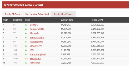
What did I like about it?
- It is easy to identify the top channels by number of views or subscribers
- The colour palette is clear using grey for background, red for channels and green for A – rated channels
What did I not like about it?
- A big table is difficult to decipher visually
- It doesn’t give you a holistic view of activity
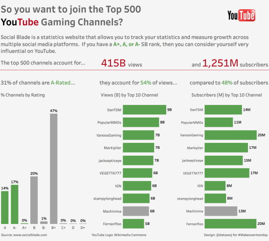
How did I approach my makeover?
My first thought was ‘who is my audience’? For this I decided upon a potential YouTube Channel wanting to break into the top 500. I wanted a story in 3 parts; a beginning, a middle and an end.
The beginning is some context about the channel rating system. The middle is some ‘Big Ass Numbers’ about the number of views and subscribers to the top 500 channels. This would give some indication of the size of a potential market to a new channel. The end is the proportion of channels which are A-rated and a break down of the top 10 ranked channels by views and subscribers. This would give some idea of the potential competition to a new channel.
Design wise I wanted to keep it simple. Bar charts are very effective for showing a comparison of size. I used colour to differentiate A-rated channels (shown in green) from non A-rated channels.
The final data visualisation is available on Tableau Public
Recent Comments