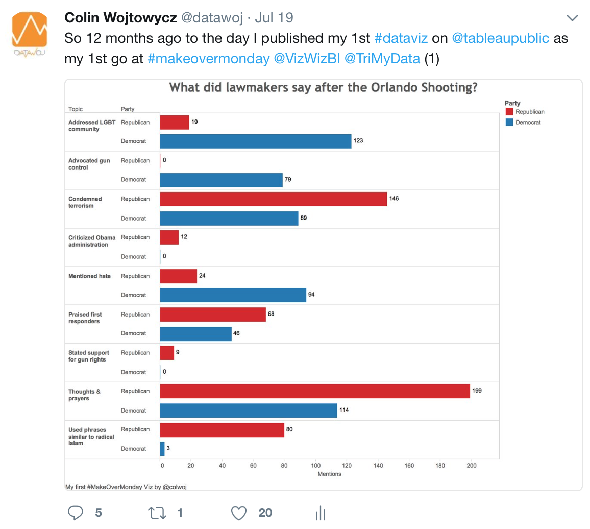
I recently re-tweeted my very first data visualisation, which I uploaded to Tableau Public12 months ago.
Mark Edwards, Sarah Bartlett and Ken Flerlage were kind enough to ask that I write my experiences down in this blog. This is a recap of that last year, including the highs, the lows and some key lessons I’ve learnt from visualising data in Tableau Desktop.
Some context
For over 18 years I had worked my way up through a challenging but rewarding career in local government research. However after many years doing more or less the same job in the same organisation I had a growing urge to try something new. I had long held the idea of being a freelance consultant in my mind.
I knew I needed to do something which would enable me to transfer my skills and experience of researching and analysing data. Further research into ‘data visualisation‘ led me to an award winning website called Visualising Data by Andy Kirk. I downloaded his first e-book ‘Data Visualisation: A Successful Design Process’ and found this quote right at the start; “welcome to the art of data visualisation – a multi-disciplinary recipe of art, science, math, technology and many other interesting ingredients”. This really resonated with me as it mentioned several disciplines I was interested in. Like many, I had been visualising data in one form or another for years but never thought of it as a discipline in its own right.
Getting the right tools for the job
Next, I researched data visualisation tools and there were a few different products on the market. In 2015, I heard a freelance visual journalist called Caroline Beavon not only deliver a great presentation on data visualisation but also mention some free visualisation software that was easy to use called ‘Tableau‘. Fast forward a year and I saw an inspiring presentation from Tableau Zen Master Rob Radburn about the opportunities and challenges of using Tableau in Leicestershire County Council. Both these presentations opened my eyes not only to the potential for data visualisation but also that there was a great tool out there to help me on my new career path.
I downloaded a trial copy of Tableau Desktop in December 2016. I was really impressed with how easy it was to create a few simple charts from my wife Ann’s fitbit data. What also impressed me was the potential versatility of the product; as well as being able to drag and drop data to create charts I could also map data and undertake statistical analysis. This made it great value for money for an independent as I wouldn’t need to invest in numerous stand alone systems.
Learning the craft
My learning has been split into two distinct learning routes; formal training and informal practice. Formally I have attended classroom sessions for Tableau; ‘Desktop Fundamentals’, ‘Desktop II (Intermediate)’ and ‘Desktop III (Advanced)’. For the latter two modules I have attended as part of a condensed Conference edition course. These are intensive days with a huge amount of information to take on board. I soon learnt the wisest approach was to keep up with the trainer as best I could and then go back to the manuals and exercises in my own time.
In October 2016 I attended a great 2 day data visualisation primer run by Andy Kirk in London. This gave me a great overall insight into the data visualisation design process as well as good practice.
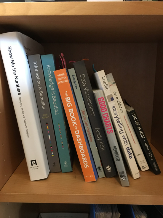
I have also read a few useful books in order to develop my knowledge of data visualisation best practice. I am quite a theoretical learner so I like to take models and processes and try to make them own.
Few and McCandless jostling for position on my bookshelf…
- Formal training gave me a solid foundation of theory to build upon.
There are also many great open resources in the Tableau Community to learn from. I have benefited a lot from Tableau Tip Tuesday authored by Andy Kriebel. This is a range of how to videos which often pop up when you google ‘how to build…in Tableau‘.
Another great resource is the Learning Tableau Blog by Charlie Hutcheson; where each week he writes about some of the technical challenges he has overcome in Tableau, often through ‘reverse engineering’ viz as part of his ‘Take Apart Tuesday’ series. Of which, downloading other people’s workbooks from Tableau Public is one of the best ways to learn Tableau.
However I knew that the very best way to learn would be to practice, practice and practice some more! I needed a way to start using Tableau regularly so I would have developed some skills by the time I started using it professionally.
- Practice helped me develop theory into tacit knowledge
Getting involved in data projects
Following the first Tableau Conference session I decided to take part in a project that kept being mentioned, called ‘Makeovermonday‘ (MOM). For those of you few who are unaware, it is a weekly social data project originally run by Andy Kriebel and Andy Cotgreave in 2016 and then in 2017 by Andy and Eva Murray. The aim is to take a published data visualisation and ‘make it over’ in order to improve the original charts. The makeovers are published to Tableau Public and Twitter for a wider audience.
You may notice that the data visualisation at the start of this blog is ‘my first makeovermonday‘ as well as my first Tableau Public data viz! Little did I know how influential this project would be in my ongoing development.
- Firstly it has given me an opportunity to develop my Tableau skills through practical application.
- Secondly it has developed a fantastic social network through following conversations on Twitter under the hashtag #Makeovermonday.
- Thirdly it has allowed me the opportunity to develop a portfolio of over 50 visualisations I can share wherever I go.
It has been challenging at times though, particularly in 2016, when I was juggling many life events; ending one career and starting another as well as finishing a post graduate qualification. Something had to give and for a few weeks it was MOM. But I persevered and started a fresh in 2017 and have since completed most of the challenges. I tend to use each challenge as an opportunity to learn and develop a new approach or skill, which can take time.
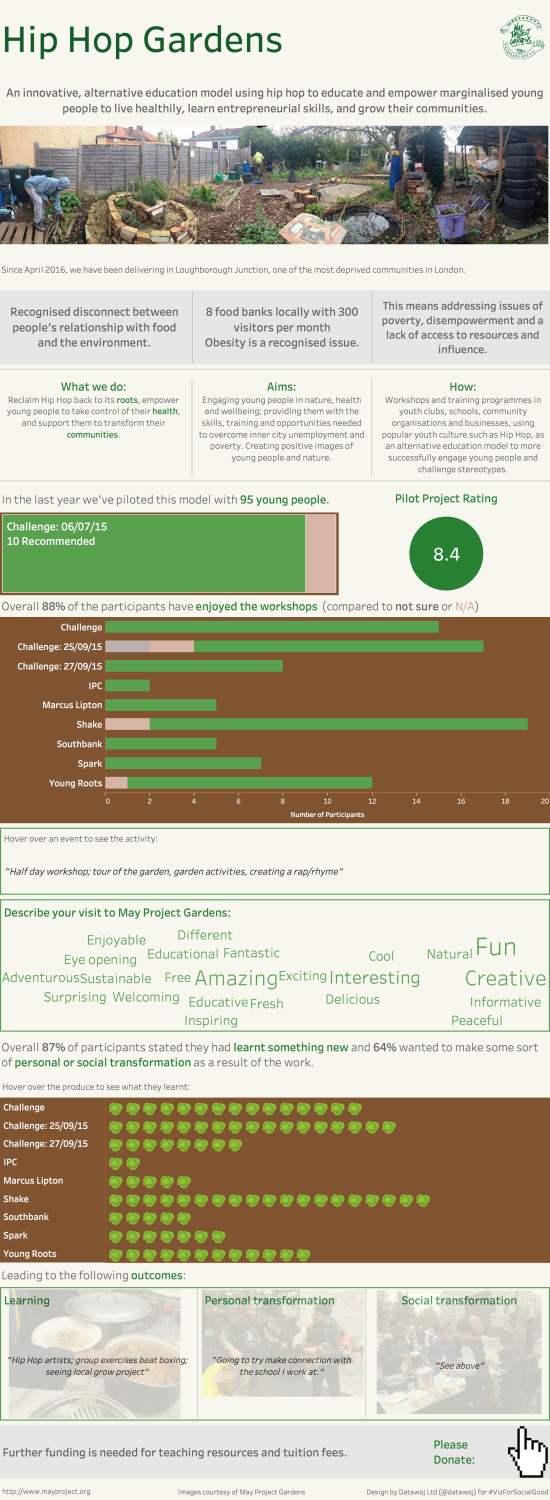
Another great project worth a mention is Viz For Social Good run by Chloe Tseng. I took part in the Hip Hop Gardens Project, which combined several things I am interested in; hip hop music, social regeneration, community gardening with data visualisation!
It was a seminal project in my design development as I tried a more long form story board. If you would like to know more, please read my blog about the project.
Hip hop and community gardening visualised…
- Getting involved in projects has helped me develop my Tableau skills, grow a network and develop a portfolio
Go where there are like minded people
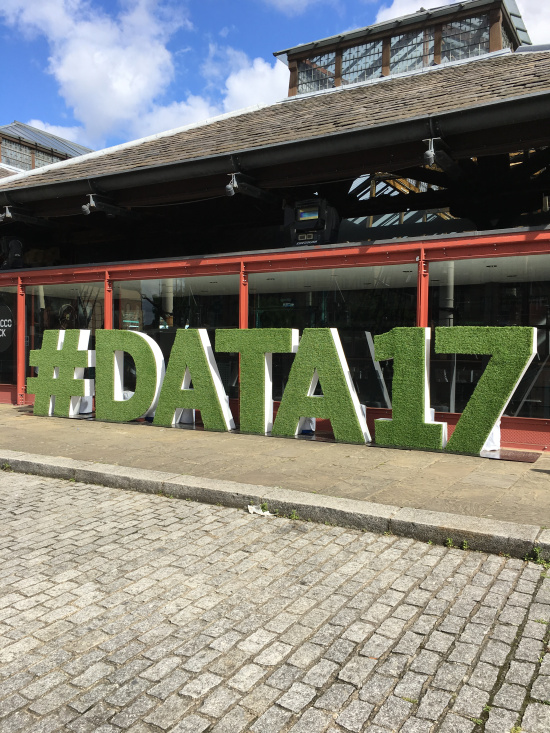
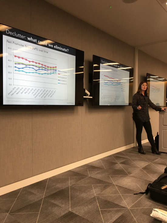
In 2016 and 2017 I attended the Tableau Conference on Tour; both times were a fantastic experience. In 2016 I was over whelmed by the range of content. I also did not know anybody and struggled to socialise but tried my best. By 2017, thanks to getting to know people from social media and participating in projects I knew a great bunch of like minded people. This made it a much more rewarding experience.
A sunny Day 3 at Tobacco Dock…#Data2017
I have also started attending the London Tableau User Group. The organisers include Pablo Gomez and Sarah Bartlett, who in particular have been really welcoming as have the others involved.
Although its a bit of a trek from the Northwest, I have found it worth it as the quality of speakers has been fantastic. For example I got to see Cole Knaflic talk about her Story Telling with Data Process of which I am a big fan.
Cole Knaflic talking at London TUG…
- Its more fun to talk about Tableau to other people, especially if you are working on your own.
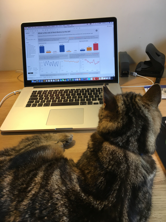
Another great place to discuss data visualisation and Tableau is Twitter. This has been invaluable for someone like me vizzing on my own, save for my cat Killi. There are too many people to mention, but of those not already mentioned, who has been really helpful is Neil Richards. If you haven’t checked out Neil’s innovative and experimental viz then I suggest you do!
Killi checks out some trend analysis of clinical prescription data…
Finding your style
I am still developing my data visualisation style with practice. I am also looking for who my audience is both professionally and personally.
I have also learnt to try to take criticism constructively and develop from it. This isn’t always an easy thing to do, but is worth the reward. Most people in the Tableau Community want to improve the quality of data visualisation and I’ve found they are more than willing to help with advice and guidance.
What I have found out works well:
- Try new things
- Ask for feedback
- Learn what works and what doesn’t
- Improve over time
So my advice to Tableau newbies is:
- Formal training is a good place to start
- Get involved in a practical project like #Makeovermonday
- Practice and learn continually to improve
- Attend a conference or a TUG
- Engage the community on Twitter
Looking back…
It has been a great 12 months of learning new craft, discovering a great new tool and meeting lots of cool new people. Its been exciting, hard work and scary all at once.
Looking forward my goals are:
- Continue to develop my technical skills
- Continue to develop my design process and style
- Achieve Tableau Associate Certification to enhance my professional standing
- Develop this blog to showcase the benefits of data visualisation to wider audiences
I would also like to find time to run some more of my own data visualisation projects. I have interests in the world of social regeneration, which I specialised in for my research career and would like to do some more work in that field.
Thanks to…
All of the people mentioned in this blog post and others in the data visualisation and Tableau Community.
I would also like to thank my data visualisation checker supreme, my wife Ann without whose support I would never had been able to make this journey.
Recent Comments