Visualisation can highlight a story in your data
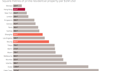
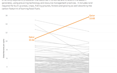
Data visualisation can be useful for highlighting relationships within sub-sets of a larger dataset. This can be useful for focussing the audience onto a particular story or point.
Tailoring Explanatory and Exploratory Data Visualisations with Colour
Creating two different designs made me think about how to use colour to tailor my data visualisation to different audiences.
Visualising the natural World around us – basic bar charts versus square area charts
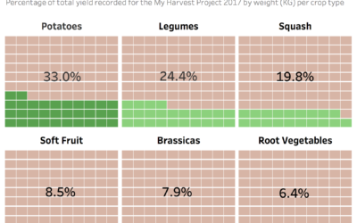
I recently participated in both the March and April 2018 Story Telling with Data Challenges: Basic Bar Charts and Square Area Charts respectively published by Cole Knaflic. This got me thinking about the pros and cons of both a common, simple chart type such as the basic bar chart versus a more unusual, arguably more complex chart type such as the square area chart.
Visualising data on the top 10 exporting countries for drugs and medicines
Tell a story e.g. the USA is the only non-European country in the top 10 exporters for drugs and medicine.
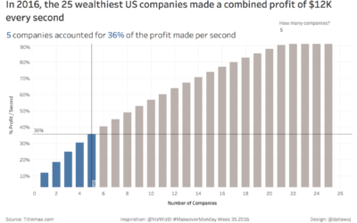
Visualising how much profit the 25 wealthiest US companies make per second
I wanted to focus upon what proportion of the total profit per second the 25 wealthiest US companies made was due to a small number of companies such as Apple? To do this I used a Pareto Chart, which compares the cumulative percentage of profit made per second to the equivalent cumulative number of companies.
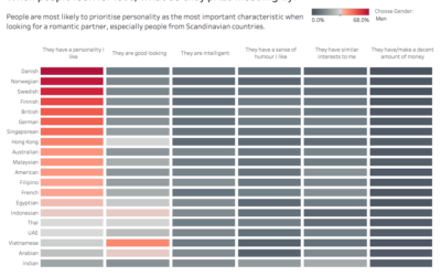
Visualising data on romantic preferences across the World
I decided to use colour more selectively to highlight the preference for personality over other characteristics.
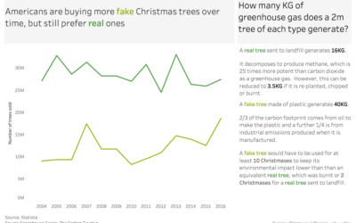
Are Americans buying more fake or real Christmas Trees?
Americans are buying more fake Christmas Trees over time, but still prefer real ones.
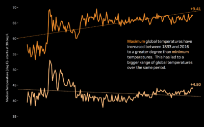
Is the Blue Dot Getting Hotter? Visualising Temperatures Anomalies Over Time
I had an idea to frame the topic as a question around ‘whether the World was getting hotter’?
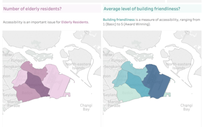
Mapping Elderly Populations and Building Accessibility in Singapore
I imagined that an elderly audience would be interested in where was on average, more or less accessible. I decided to compare the elderly population to the average level of building friendliness at the state level.
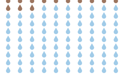
If the World was 100 People – How many would have Safe Water?
I also think it is important when highlighting social issues such as this to also add a call to action to make the reader think. I added the Water Aid logo with a link to their donation page, after consulting them for permission.
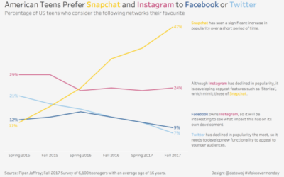
Visualising Data on Which Social Media Network US Teenagers Prefer
My goals…use colour in the titles and annotation to identify the brands, removing the need for a colour legend. This creates a cleaner, less cluttered visualisation.
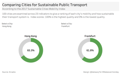
Comparing Sustainable Public Transport in Two Cities with Dough/Donut Charts
My approach…to create an exploratory visualisation, which allows users to select two cities for comparison.
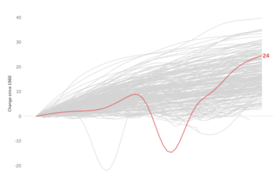
How has life expectancy changed in countries since 1960? A data visualisation makeover
The highlighter allows users to select a country and then it stands out.
Dots, Areas, Tiles: Comparing 3 Map Types for Data Visualisation
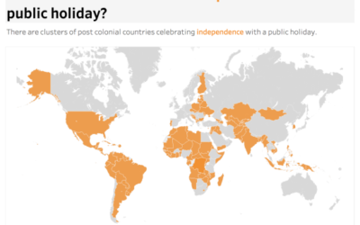
The filled area map works well to engage as the full extent of each country is coloured.
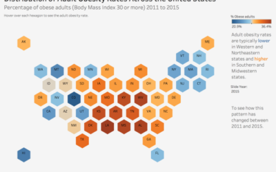
Visualising Adult Obesity Rates by US State
My goals…employ a hexagon tiled map to equalise the size of each state.

