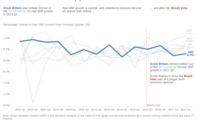
How has the British Economy grown before and after the Brexit Vote?
My goals…tell a compelling story to engage the reader.
How can the Storytelling with Data Process enhance communicating your Big Idea?
By following the Storytelling with Data Process, I feel I have gained valuable insight into why a data visualisation can provide clarity with an audience and therefore why they would want to engage with it.
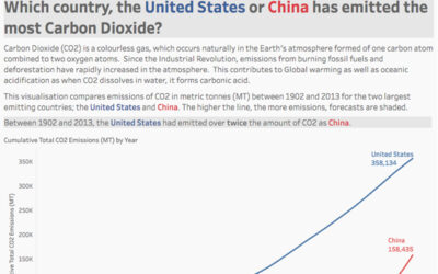
Comparing CO2 Emissions for The USA and China Over Time
The aim was to explore changes in CO2 emissions between the United States and China, both the two largest emitting countries.
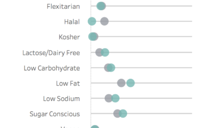
Visualising Restricted Diets Around the Globe
I wanted to utilize interactivity to allow the user to compare each Global region to the Global average via a drop down filter.
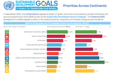
Sustainable Development Goals Action
The MyWorld 2030 Survey aims to collect people’s views on the state of poverty, inequality and climate change across the World.
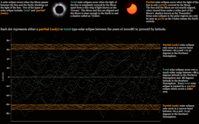
How can data visualisation help identify and communicate complex patterns?
The objective of most data visualisation projects is to analyse and explore data in order to identify some interesting trends, which can then be communicated as valuable insight to a wider audience.
How to maximise the impact of your data visualisation
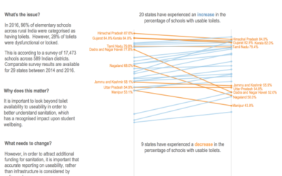
The challenge for week 32 of Makeovermonday was to improve upon a visualisation from Business Standard, which looks at the percentage of schools across India which have usable toilets. As someone who has studied human geography I found this an interesting and...
Year 1 of Tableau – my journey into data visualisation
I recently re-tweeted my very first data visualisation, which I uploaded to Tableau Public12 months ago. Mark Edwards, Sarah Bartlett and Ken Flerlage were kind enough to ask that I write my experiences down in this blog. This is a recap of that last year, including...
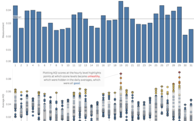
Visualising individual data plots using Box and Whisker charts
Introduction: Each week I take part in a data visualisation challenge called ‘Makeovermonday’. The idea is to take a data visualisation that has already been published and make it over using good practice techniques. I use an industry leading data visualisation tool...
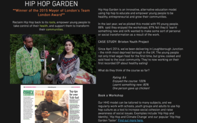
Hip Hop Gardens – A Viz for Social Good Project
IntroductionI recently took part in a really worthwhile data visualisation project called ‘May Project Gardens’; featured under the #VizForSocialGood Programme run by Chloe Seng from the Tableau Community. I was excited to take part in this project for several...
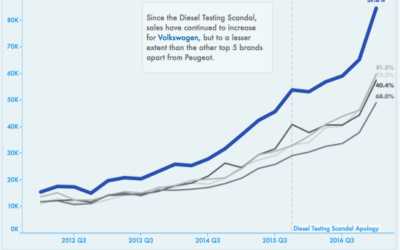
Did the Diesel Testing Scandal Affect Volkswagen Car Sales in the Netherlands?
Each week I take part in a data visualisation challenge called ‘Makeovermonday’. The idea is to take a data visualisation that has already been published and make it over using good practice techniques. I use an industry leading data visualisation tool called...
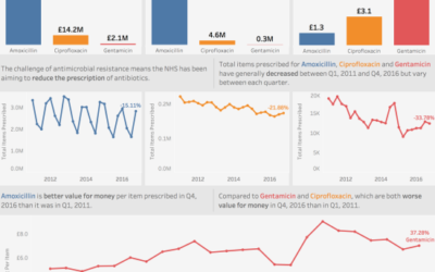
Lessons learnt visualising BIG DATA
This week in #Makeovermonday we got to play with some really ‘Big Data’. The task was to makeover any one of a choice of data visualisations from a Government Briefing Paper on UK GP prescription data, which was made available on a fast analytic database courtesy...
Using colour to tell a better story with data
Each week I take part in a data visualisation challenge called ‘Makeovermonday’. The idea is to take a data visualisation that has already been published and make it over using good practice techniques. I use an industry leading data visualisation tool called...
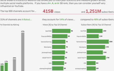
Visualising the Top 500 YouTube Gaming Channels
Each week I take part in a data visualisation challenge called ‘Makeovermonday’. The idea is to take a data visualisation that has already been published and make it over using good practice techniques. I use an industry leading data visualisation tool...
